(For the eager ones, I’ve written a new version of WikiGeoLinks with Leaflet and Bootstrap. It lets you discover interactively how the georeferenced articles of the Wikipedia are connected. If you want the long story, scroll down…)
I’m sure one of the most common ways in which people use Wikipedia is jumping to different articles from the original one they were checking in the first place. At least that’s how I spent most of the time on it, getting dragged into interesting stuff. This can be of course a great productivity killer, but I think this “courseless” browsing is very rewarding because you never know what you’ll end up discovering.
I’ve also always liked this mental image of linked Wikipedia articles forming a huge network with clusters around popular articles, and sure there are countless visualizations all over the Internet that show at least at part of this mammoth graph.
But what about the spatial connections between Wikipedia articles? A huge number of articles have coordinates associated, and are obviously linked to other ones, so how would this network look like on a map? One could try to create a global, static visualization like the one that came up a while ago of Facebook connections, but as beautiful as these images are, they are not interactive. I wanted some form of the “mindless” browsing I mentioned before, that would allow discovering interactively what articles were located around a certain area and which other articles they linked to.
That’s why a while ago I wrote a first version of WikiGeoLinks , a web application that let you locate Wikipedia articles on a map and see how were they connected. This first version was built with GeoExt and OpenLayers, and used a GeoJSON web service powered by MapFish. After locating an article on the map, its linked articles were shown and you could click on them to see their connections, carrying on for as long as you wanted.
Making it nicer
I was definitely happy with the original version, and it was a great opportunity to learn in depth how GeoExt works, but to be fair it didn’t look that nice. Ext based applications have a very specific and valid use case, but I wanted the site to be lighter and more attractive, both visually and in the code.
The first step was switching the default OpenStreetMap tiles to the ones that have become my first choice in all my recent projects: MapQuest-OSM. They offer direct access to the tiles, which are OSM based and look gorgeous (specially at small scales), so what’s not to love about it?
I had played around a bit with Leaflet before, but this was a good opportunity to use it in a complete project, learn how it worked and see how it compared to OpenLayers, the mapping library I have more experience with. Praising Leaflet at this stage may seem unnecessary, but I’ll do it anyway: it is a joy to work with it. Its API is clean, simple and intuitive. It is fast, easy to extend and ridiculously light-weight. If you are used to OpenLayers though, you may find some things confusing at first. I’ll try to write another blog post going in more detail about this.
Finally, to glue it up all together I’ve used Bootstrap, which is quickly becoming the cornerstone of dozens of websites. It has turned out to be a great tool for online mapping applications, and the widgets it offers are easy to integrate as traditional map controls like toolbars or layer switchers.
What’s next?
There are a number of things I would like to add or improve, here are a few of them:
-
The underlying data is outdated and does not include all georeferenced articles. I plan to use the more up to date data available at the Wikipedia-World project.
-
The GeoJSON service can be a little bit slow. It can probably be optimized in some ways (or maybe I need to upgrade my Linode…).
-
I would love to have some way to generate a permalink to a series of linked articles, so you can save your “routes”.
-
It can definitely be made more mobile friendly, for instance avoiding hover events.
And some other, more vague ideas (some of them definitely pointless):
-
Maybe the Wikipedia API can be used to pull some more content about the articles in the popups (summary, pictures…).
-
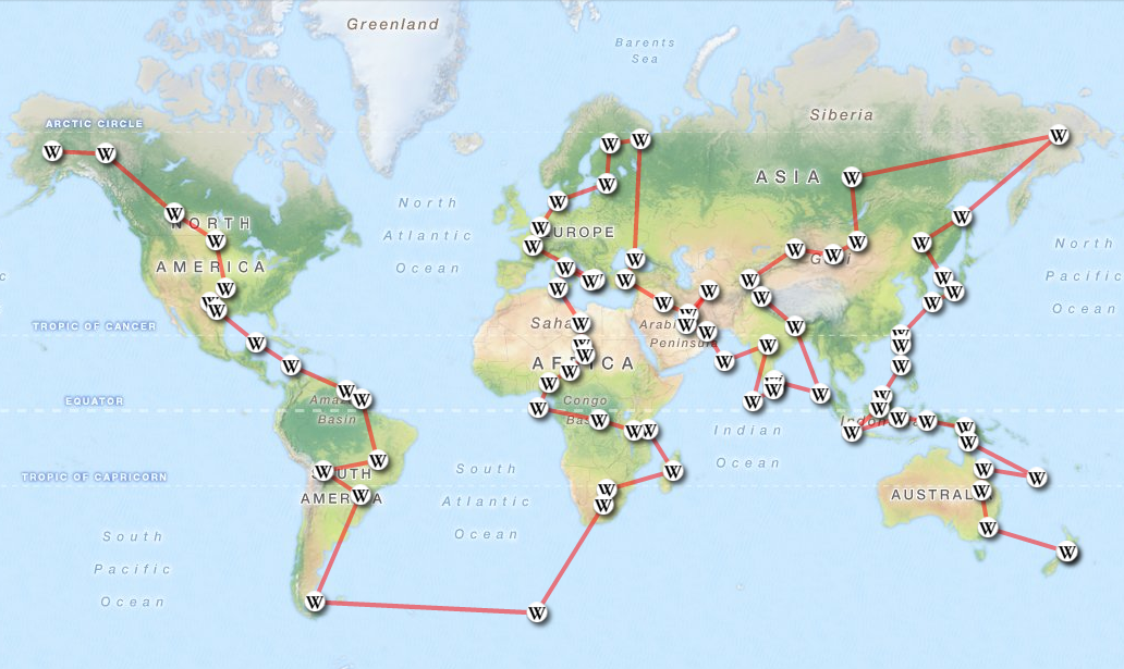
Can you build a Wikipedia “route planner”? e.g can I go from [La Paz](http://amercader.github.com/wikigeolinks-leaflet?a=La Paz) to Matsushima via georeferenced Wikipedia articles?
-
How cool would it be to be able to do the same on a 3D Globe?
I hope you like it and spend some time wandering around. I would love to hear your comments, and also feel free to add any issues you may find to GitHub, where you can also find the source code.